Meatballs!
Figuratively speaking.
Meatballs! - A User Experience
Before you get too excited, these meatballs are metaphorical. Imagine for a moment, you and your plus one spot a quaint little restaurant as you stroll down the block. Curious, you pause to learn more about it. “Meatballs”, someone shouts at you! “Caesar salad, vegetable soup, branzino!” You haven’t even gotten through the door and looked around before the host is shouting menu items at you. What’s the likely response you’d give? You might be confused, mildly amused or suspicious. If you were really hungry you might ask for details, such as a table for two or if the meatballs come on a plate. Probably, you weren’t going to reach for your wallet and hold out your hand for a meatball.
This scenario is exactly what we’re seeing on a lot of websites. We arrive on the page and wonder what it is the company actually does. As we look for some simple and direct explanation of their primary purpose, we see lists of problems to solve, icons of services provided and menus filled with industry-specific needs. Strange as this may sound to website owners (and developers), these services don’t necessarily tell visitors what the company is about.
We’ve all heard the term User Experience or seen the shorthand (UX). I think there’s even a college degree in UX now. However, what does this really mean? For most, this is customer service. In essence, it is a little more than that. Much more, if you consider customer service as merely fixing problems, answering questions and taking sales orders. Experience with a capital X is the key element here. Walking away from that little restaurant, purchase or no purchase, what would you remember about the brand? The little Italian-style plaque beside the door or the smell of freshly baked bread? The checkered tablecloth or the waiter’s flour-stained apron, maybe? I’d wager you’d remember the screaming host yelling in your face about meatballs and how surprised and awkward you felt. Given enough time, you may forget about the actual behavior, and simply associate the restaurant with that awkward feeling. This is probably not the most conducive to being re-engaged, even if you find yourself nearby and hungry once more.
Transcend being a meatball salesman... sell your brand.
Keeping up with consistency.
Meatballs! - A User Experience
Perception is another thing entirely, and shouldn’t be ignored when it comes to cohesion. For this, you should strive to understand and embrace your customer’s perception of your brand. If you sell swimwear, for example, your brand perception is likely to include warm weather, beaches, sun tans and sexiness. A dark blue background split by a white-hot lightning bolt over the words, electric swimwear, might be executed with beautiful artwork – but its design is noticeably lacking. Your product, packaging, brand and overall message should be consistent with brand perception as well.
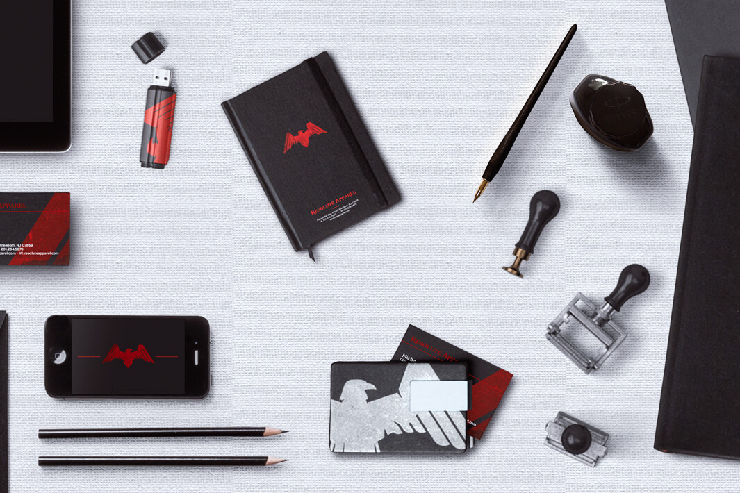
If your brand is spread out over many products, concepts or services, it might be hard to establish a cohesive message. Consider creating individual brands or collections that each carry a cohesive messaging related to their product, appearance and perception. Creating a style guide is a great way to help organize your branding and brand assets and provides a good visual representation of your umbrella brand. A style guide also formalizes how those assets can be used to provide consistency. With or without a style guide, before designing a large offering, consider how each segment might or might not fit into any existing brands or if any new brands are needed. Of course, you can always outsource such an assignment ;-)The user’s experience is important for a few reasons, not just to get them to make a purchase or call your salesman. This interaction with your brand might mean a lasting impression and the difference between someone who’ll tell others about you and someone who might avoid your business in the future. A memorable and positive experience can yield repeat business, larger orders, brand ambassadors and quicker sales. Visitors to your site might be checking out your brand before they stop by in person or after they met your salesman. Maybe they’re comparing you to a competitor. Even if these visitors aren’t looking to make a purchase right now, their experience will directly affect your success.
Take a look at your own website, or as you think about having one built for you, consider what a potential customer might think of it. It might go without saying, but we’re saying it anyway, put yourself in your customer’s shoes. You, your employees, your friends or your family may not be your target audience. Even if they are, they may not represent your average audience member. Consider what a potential customer might think when they first arrive on your website. Perhaps they aren’t experts in the industry (maybe they should be, or they only work for someone who is). The first thing a visitor expects to see is some indication of what the website owner does. Not lists of services you provide, they want to know how you can help them, even if they don’t understand how you do what you do. A bold elevator pitch, mission statement or straightforward claim is the website version of a welcoming handshake and introduction. If your industry is technical, but your clients aren’t necessarily experts, this concept is even more important. Perhaps your target client is a business that might purchase your technical service. Are you designing the experience for the decision maker who might agree to hire your company or the technician who will be working with your product or service? Remember to include them both in your design, at the appropriate page. Industry experts might skip over your homepage looking for those service lists, while other types of customers might want to read the very first words on your website to get a sense of who you are. All the clever service names, reassuring icons and industry jargon can wait till later. First, tell them they are in the right place. Tell them you have a nice table for two by the window and when they settle in and have a moment to look around, you can offer to read them the specials and tell them about your meatballs.
- Super Simple - February 15, 2019
- SEO Sea - January 18, 2019
- Meatballs! - December 18, 2018
Related Articles
7 Website Mistakes You Don’t Want to Make
Communication,Design,Marketing,Technology,Art,Retail
May 18, 2017
8 Comments7 Minutes
5 Things You Didn’t Know About 3D Photography
Design,Marketing,Technology,Art,Retail
May 5, 2017
2 Comments4 Minutes


